As many refrigeration engineers around the world, I’ve always been curious to understand better how this machinery behaves transiently. For the ones who do not know the Variable Retention Tunnel, take a brief stop at Google before reading on, so you can appreciate better what I’m talking about!
In practice, we see that when the production rate increases, the heat load rises and the compressors might struggle to keep the evaporation temperature low. Therefore, the evaporator temperature rises, which makes the air temperature inside the freezing tunnel rise as well. The system is constantly looking for some equilibrium point, where the evaporator temperature fits for the current product mass flow rate.
But as each product cools down and eventually freezes, the heat transfer at its surface slows down because the surface temperature drops. This means some of the product inside the tunnel is not contributing to the heat load as much as the fresh, hot product that just entered the device. And all of this is happening simultaneously, which makes the appreciation and understanding of the process remarkably difficult.
So, recently while working on a project I had the idea: Why don’t I simulate the system so I could grasp better what is actually happening? I began, then, an endeavor towards this objective, and the concepts I could get in the path were quite enlightening.
1. The product comes in waves
Probably you are familiar with the product freezing curve shown below. It tells us the temperature evolution in time for some unfrozen product that is subject to a freezing process. The surface freezes first, then the low temperatures slowly (depending on the product’s thickness) reach the center of the product.

Another thing this curve also tells us, although indirectly, is the power the product releases onto the environment air. As 

The implications of this are quite interesting: As the curve shows, the temperature difference (and therefore, the power) drops by half as much in the first hour. So the product contributes the most to the heat load in the first hour, and then it “locks” the inner heat inside the product, making the heat transfer process much slower. As product is constantly coming in the tunnel during the loading hours, the effect looks like a wave of products, as shown in the video below:
The tunnel in this video has a 12h minimum retention time for any given product. This means during the working hours it is almost always full of “hot” product. When product stops coming, then it gradually stops “heating up” the tunnel and global heat load drops. But how does this translate in the total heat load transient profiles?
2. The daily oscillating heat load profile
Unfortunately, in practice we cannot measure the total heat load except with quite expensive equipment (and even so it would be quite inaccurate). But after simulating a whole tunnel, one can just integrate the data and get the total instantaneous heat load at each instant simulated.
Of course, the heat load profile will depend on the production schedule and on how long and when the compressors are turned off to save energy. In some countries, there is a strong variation on the energy fees depending on the hour of the day and on the season of the year. These variations are placed so the energetic system is not overloaded during the hours most people are home using electricity (normally early in the night), and companies are stimulated to turn off their machines when the fees are higher.
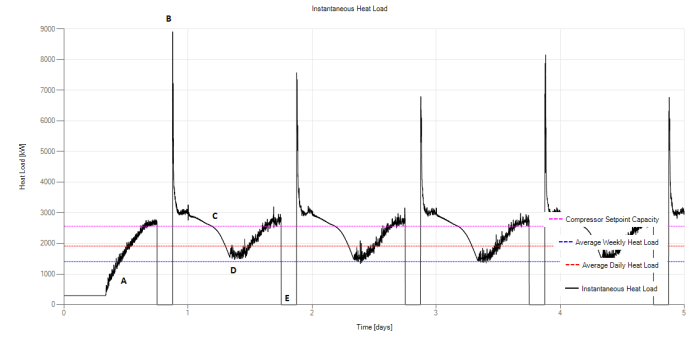
These factors make the heat load profile very rich and detailed. Below there is a picture of the same tunnel’s simulated profile during five days. The profile looks very repetitive, with the same peaks and troughs daily. During region A in the graph, the tunnel is empty and heat load builds up as product enters the tunnel. The heat load drops to zero in region E because the fans and the machine room are turned off between 18:00 and 21:00. Since the production is still ongoing during these times, the heat load peaks to B briefly during the machine room retake. This far exceeds the capacity of the compressors at the setpoint, and the machine room will struggle during this time. As product stops being fed into the system (at 0:00), the heat load stabilizes and, during the off-production hours (from 0:00 to 8:00, it drops until point D in the graph. This cycle runs around every day, and during the weekend break the power drops to zero (remaining only the conduction through insulation and the fan power). The weekly cycle begins again.
3. The machine room struggles… But sometimes that’s okay
I thought that instead of assuming the machine room was “sized” to properly maintain the evaporator pressure at all times, I’d rather have it to “struggle” maintaining it at the setpoint during these high heat load periods of the day. “How would this affect the product?”, I asked myself. So let’s examine the chart below:
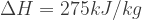
The tunnel starts the week, again, with virtually no heat load as the product’s temperature is already homogenized with the air temperature for staying so long during the weekend (region A). As product slowly loads the tunnel, the air temperatures (region B) rise but the machine room is still partially loaded and still keeping the evaporator temperature. In region C, the heat load of the product exceeded the machine room heat load, increasing the pressure of the evaporating fluid (and therefore, 

In region D, the compressors are turned off for 3 hours, and the temperature readings are virtually meaningless. After turning on the compressors (region E), the huge heat load hits the machine room hard and makes the evaporator’s pressure rise all the way to a saturation temperature of -26ºC. Then as the heat load slowly settles down to a smaller value, the compressors begin to catch up.
This is a beautiful picture of the freezing tunnel and one that corresponds quite closely to what I saw in my experience. But if the compressors cannot keep the evaporator setpoint temperature, isn’t it a compressor sizing problem?
Well… It’s complicated. On one hand, the compressors normally are sized for a heat load that meets some average or “guessed” instantaneous criterion. Let’s say, for example, that one sizes the machine room capacity to meet the instantaneous heat load of an hour. The data used for this simple calculation is:


The total power required for these compressors would, then, be:

Which corresponds to the magenta dotted line in the heat load chart. As the chart shows, the magenta line is below the peaks each and every day. But does this mean the compressors are undersized? This would mean they should actually be sized to a 9MW capacity, that occurs for a short half-an-hour. Is it worth it?
Well, it turns out, in practice, it’s not. The whole system has quite a lot of inertia. This tunnel stores 300 tons of product, which slows down the reaction time. Therefore, some transients can be accepted. But how far can we go?
Let’s say that another designer “wants” to size the same system for a daily average heat load. The system design heat load now will be reduced to 

Well, let’s take a look and see what the product does. As different products stays different times in the tunnel (I’ll talk about this), then some products will exit at a lower temperature than others. This means there is some “statistical distribution” of the products, which is displayed in the next chart.
The chart actually shows the integral of statistical distribution, shows as a percentile. Let’s take the point (-30.2 ºC, 40%) in the upper chart as an example of how we read this chart. This point says that if I take a sample of the lowest 40% of the products outlet temperatures, the largest temperature would be -30.2ºC. In other words, 40% of the product is at -30.2ºC or lower.

The two charts above show that when we reduce the machine room compressor’s capacity, the average outlet temperature at the center of the products will be larger. But we need to compare it with a threshold, which is shown as a black dashed line in the chart (-18ºC). In the upper case (larger compressor), 99.6% of the product meets or exceeds the -18ºC threshold line. In the lower scenario (smaller compressor), a lower portion (97.1%) of the product meets the threshold line. To define whether these numbers are satisfactory or not is a decision the plant operator must make.
4. But I, the designer, shall dictate the capacity of the system!
The takeaway from the previous section is that the heat load of a given system (and this applies to other thermal systems as well) is not something we “decide”, but a product of the operational variables. Of course, we can control most of the operational variables, but we shouldn’t assume that’s always the case.
Another designer might say, for example, he “wants” to size the compressor to the weekly averaged heat load. He argues that the weekend time is idle, compressors are shut off unnecessarily during this time and he ought make the initial investment lower by putting more machines that will operate the whole week, therefore saving millions of dollars! Is that possible? Let’s see…
So the figure below shows how the temperatures behave for this compressor sizing. We can see that the oscillations are wilder, the peaks are roughly 5ºC above the previous simulations, and the machine room saturation temperature is constantly oscillating according to the tunnel heat load. But still at the weekend, the heat load drops and the compressors need to be shut off.
So no improvement happened here, the compressors are still struggling during the week and being shut off during the weekend. Why? Well, that’s because we, as I previously mentioned, cannot dictate the heat load. The system does that. We just size for it.
So you’re probably curious to see how did the product temperatures perform under these “undersized” conditions. As shown in the figure below, we have now 75.4% of the product meeting the -18ºC center temperature criterion. It’s not remarkably bad, actually – but some clients will not be remarkably happy with some -10ºC measurements in their quality control spreadsheets. That’s the reason why we oversize!

5. Conclusion
This is sort of a results article. I believe I’ll write some other articles on the mathematical devices I used to put the simulator together. I hope it was enlightening for you, the reader, as much as it was for me. If you think that kind of simulation would be useful for you, feel free to contact me.
Thanks for reading so far!
